Working on customizing the Salesforce experience for U.S. Bank’s investment arm was a rewarding and challenging opportunity.
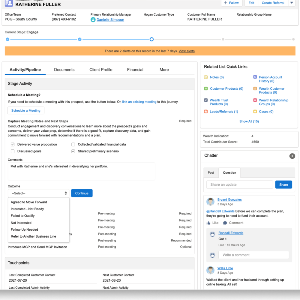
We added new functionality to users’ dashboards to help them see at a glance where they are in the sales process (the stage progress meter at the top), a way to quickly assess and prioritize a potential customer (the wealth indication and contributor scores on the right), recommended actions and CTAs within the main body – including ways to “document” interactions without laboriously filling out forms, and integrated Chatter into the main experience (lower right).
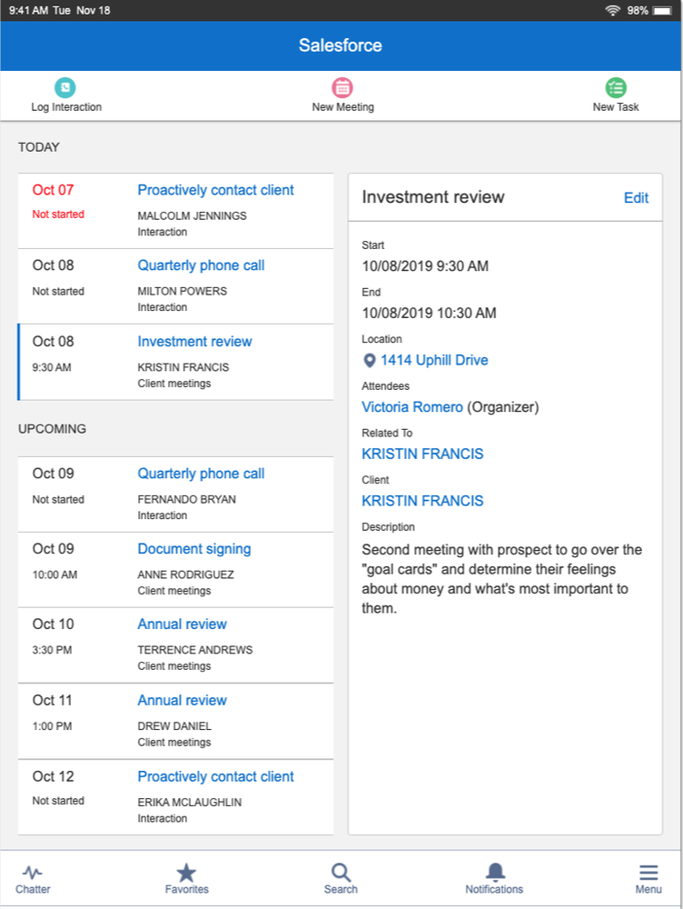
We also did significant work on making the Salesforce experience work well for advisors who weren’t necessarily at their office computer. After talking with advisors, they almost all reported using their iPads extensively while in the field, which accounted for the majority of their day. They wanted to quickly and easily find customer details, see upcoming meetings and calls, and be able to make notes with a few taps instead of typing them out.
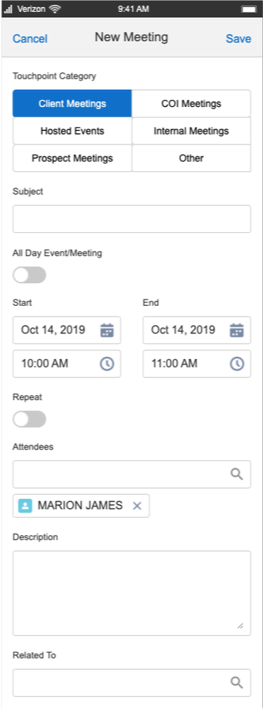
Although less commonly requested by users, we also explored ways to support their work using just their phone, like the meeting-creation screen above. The guiding UX principal for mobile design was similar to PDAs of decades ago: the phone is acting as an extension of the tablet/laptop experience instead of trying to accomplish everything that Salesforce has to offer.